The fonts should be easy to read. The font style should be a sans serif font similar to Helvetica or Arial medium.
The letter height depends on the reading distance. A letter height between and for each metre of viewing distance is preferred. The letter height should not be less than .
Usage of too many type sizes on any one sign should be avoided. Also italics, script texts, condensed texts, light stems should be avoided. Consistent font stem widths should be used.
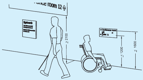
All dimensions in millimetres.
FIG. 100 HEIGHT OF SIGNS
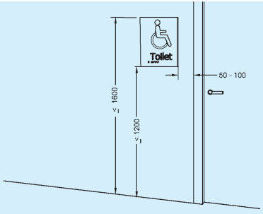
All dimensions in millimetres.
FIG. 101 LOCATION OF DOOR SIGNS ON THE LATCH SIDE OF THE DOOR
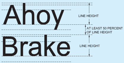
FIG. 102 LINE HEIGHT AND SPACING
CHARACTER PROPORATION
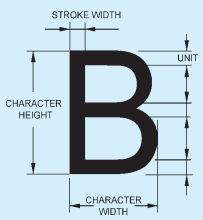
CHARACTER HEIGHT

FIG. 103 DIMENSIONS OF CHARACTER IN A SIGNAGE SYSTEM
PART 3 DEVELOPMENT CONTROL RULES AND GENERAL BUILDING REQUIREMENTS
It is recommended that messages of single words or groups of words begin with an upper case letter and continue with lower case letters (sentence case).
The words should not be placed too close together. Adequate height spacing should separate the lines. Lines of text should be ranged from a vertical line (unjustified).
Signs with a single word may be centre justified, else the text should be left justified.
The spacing between two lines shall be 50 percent of the line height (see Fig. 102).
A style shall be chosen based on a character width-to-height ratio within 3:5 and 1:1 and the stroke width-to-height ratio between 1:5 and 1:10. It shall be consistent for each sign (see Fig. 103).
B-24.2.6 Differences in LRV
Minimum difference in LRV for small targets, such as signs and inscriptions, to signboards, should be 70 points. Signboards should have a minimum difference in LRV from the background of 30 points.
Red-green combination should be avoided. Difficulties in perception can also appear when using the colours green, olive green, yellow, orange, pink and red (see also B-24.3 for contrast).
B-24.2.7 Glare Free
Signs should be glare free when mounted. This depends on how the sign is placed, the material and the illumination. The background, graphical symbols, logos and other features shall be of a matte or low sheen finish.
B-24.2.8 Illumination
Signs should be well illuminated with no glare with uniform lighting over the surface of the sign of between 100 and 300 lux. Minimum acceptable level of lighting for directional signage, maps and text panel is 200 lux. Signs can be luminescent or artificially lit.
B-24.2.9 Understandable
Signs should be readily understandable. They should be designed so as to be simple and easy to interpret. The message should be unambiguous.
Short sentences and simple words should be used. Abbreviations and very long words are hard to understand and should be avoided.